
12 Nov 2015
Energy Predictions
I found this interesting use of a streamgraph on Dribble the other day. The aim is to show a 7-day prediction of a home’s energy consumption using stacked areas to define a continuous range of values, presumably in lieu of stacked bars. Using some interpolation, this approach emphasizes trend over time rather than discrete quantities.
In addition, some animations are sprinkled in for added effect and delight, as well as transitions for object constancy.
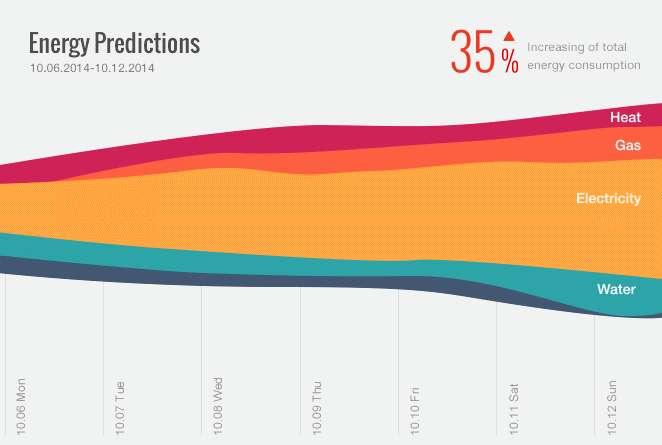
What makes this chart so attractive is its simplicity and visual appeal. It seems that it would be easy to glean useful conclusions without a need to carefully study the various elements. Incidentally, that’s why bar charts and line graphs are so appealing—they give a big bang for the buck.
I decided to try a rough implementation, which yielded some interesting lessons about the difference between concept and reality in data visualization. While I tried to stay true to the concept where possible, once I plugged in some arbitrary values some edge cases popped up that required tweaks to maintain the chart’s usefulness.
It’s important to note that this isn’t meant to be a critique of the concept itself—which I think is quite brilliant1. It is a concept after all and was probably created as an inspiration rather than to fit a an existing system. Still, I found it instructive to study the gap between theory and practice through implementation.
If you haven’t already, I recommend you take a moment to check out the animated concept, and then take a look at my implementation. Try clicking the various layers to isolate a particular layer. Click the layer again to zoom back out.
Consider The Data
Before I got started I needed to define the layers a bit better so the chart would be meaningful and properly communicate the the trend behind the values.
The concept shows electricity measured in kilowatt-hours. However, water is typically measured by volume (e.g., gallons or liters). Perhaps in this case the intent was to indicate the amount of energy used to heat up water. This might be confusing though since that amount would likely need to be subtracted from the total gas or electricity. Regardless, values must be normalized to be stackable2.
Similarly, heat is a somewhat ambiguous quantity. Heat is most often produced via electricity or gas, which again would overlap with other layers. It can also be produced via coal, wood, or jumping jax, so the label would need to be more specific. As a first draft I decided to keep these layers as-is to maintain similarity to the concept. But this would have to be dealt with in a next iteration.
The bottom layer represents an unlabeled category, which I left as “other”. Perhaps this would be used to separate alternative sources of energy like solar panels or hamster wheels, even though those usually end up as electricity as well. Perhaps this would be more appropriate for industrial applications where other forms of energy are used.
Data Is Unpredictable
To maintain context through the zoom animation, the labels are transitioned to their new, prominent position smoothly and maintain their color. Since the labels start out white this creates a dependency on the available background at the end position. It works well in the concept because the data trends upwards, creating a large enough backdrop for the label. However, we also have to consider what would happen if the part of the chart where the label ends up was quite small. If the the data were to trend downwards—as it does for Water—the white label would end up against a white background and become invisible.
To resolve this I changed the label color at its prominent position to almost black. This isn’t a perfect solution, unfortunately. The transition from white to black seems to diminish some of the intended constancy. Also, for darker hues the black is less readable (see the Heat layer). Perhaps a different choice of layer colors would improve this.
This highlights an important point. Just like code, visualizations need to be tested. This can be simple where static data is used, since the possible states are well defined. It’s more difficult and even more important for dashboards, for example, where the data isn’t known a priori and the visualization is applied to effectively arbitrary values.
Tweaking For Taste
Finally, I decided to exercising some creative override where I saw a need for tweaking. This was partially based on preference but also to fill in some gaps not shown in the concept.
For example, while the initial animation looks snazzy, I found it a bit over-the-top without adding much meaning. Instead I opted for a simpler movement from the bottom. I also considered having the layers start with a zero-height in the middle and expanding outwards to their initial thicknesses. Or nix the initial transition altogether.
Also, I assumed the designer would have wanted the animated trend triangle to move from top-to-bottom for a downward trend.
Learn on
This experiment was a fun side project. There were some interesting technical hoops to jump through, but I think it also brought up some important points about the process of data visualization. Taking the first step from concept to implementation really highlighted the importance of iteration and communication. It also forced me to think about the visualization’s utility rather than its visual design alone.
I think the next step, even before refining the visualization further, would be to test it with real or otherwise sensibly simulated values. This might reveal new edge cases or allow us to optimize for an average dataset.
1 Kuddos to the talented designer of this concept, Kingyo. He has a collection of beautiful designs on his dribbble profile.
2 Gas is most typically measured in BTUs (or sometimes Therms). This isn’t a problem, since energy units can be normalized to form a proper scale, but it’s worth a mention that the implementation has to perform the conversion.